

How to prepare a display wall graphic design without losing quality?
A design that looks good on a monitor can look completely different on a wall several metres wide. A small photo loses sharpness, thin text becomes illegible, and a logo placed too close to the edge ends up on a seam, a fold or outside the visible area.
A good graphic design for a display wall isn't just about looks. It has to take into account the system structure, the type of material and how the graphic is fitted. Below we explain how to avoid typical mistakes before you send the file to print.
Choose the specific system first
Don't start the design until you know which wall model it is for. Two structures of similar size may need completely different files. The graphic format, bleed, flaps, seams and areas hidden after assembly can all differ.
A graphic pulled over a tube frame is prepared differently from fabric with silicone edging for an LED system, and differently again from a print for a curved wall.
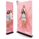
Take the Atlantis Straight – TUBE fabric wall. The fabric is pulled over the frame and wraps around it, so part of the design goes onto the sides. LED BOX™ PRO with print is, in turn, a backlit, double-sided system. Here both the way the graphic is fixed and how it looks with the light on matter.
Before you start, ask the supplier for the current production template for the chosen model. Don't draw it yourself based on the size in the product name.
What should a production template contain?
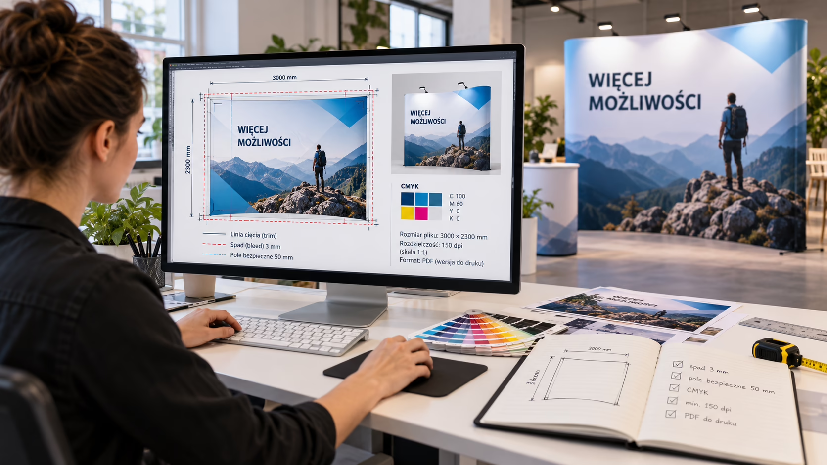
The template shows how large the document should be and where its key areas are. Markings vary depending on the system and print house. You will usually find:
- the full production file format,
- the format visible after the graphic is fitted,
- bleed or technical flaps,
- a safe area for text and logos,
- seam, fold or edging lines,
- markings for the sides and fitting direction,
- the scale the document must be prepared in.
Keep the technical layers in your working file, but check the instructions before exporting. Guide lines must not be printed. If the template has a separate layer with notes, you usually need to switch it off when creating the production file.
Design at 1:1 or reduced scale?
Large formats can be designed at full or reduced scale. It depends on the printer's requirements and your graphics software. The most important thing is to stick to one scale.
If you work at a reduced scale, scale all elements down in the same proportion and increase the photo resolution accordingly. Example: in a 1:10 file the working resolution should be ten times higher than the one you expect at the final size.
Don't change the scale just before exporting without checking the result. Stroke widths, shadow sizes, raster effects or photo quality may change.
Photo resolution and large-print quality
Quality is most often spoiled by photos that are too small. What matters is their effective resolution after enlargement to the size they appear in the design. A file weighing a few megabytes proves nothing on its own.
The resolution you need depends on the format, the material, the printing technology and the distance the wall is viewed from. There is no single value for all products. Ask the printer for the specification and check the effective resolution in your layout software.
How can you tell a photo is too low quality?
- When enlarged, you see pixels or jagged edges.
- Fine details, e.g. hair, fabrics or product outlines, are blurred.
- The photo comes from a website or a messaging app.
- A small photo has been stretched over a larger part of the wall.
- You can see heavy compression, colour shifts or square artefacts.
Artificially adding pixels won't restore detail that wasn't in the source file. If a photo is too small, choose a different shot, buy a larger file or reduce the space the photo takes up in the design.
Prepare logos, icons and text as vectors
Vectors can be scaled without losing sharpness. That's why logos, pictograms, simple illustrations, charts and lettering are best kept in vector form.
A small PNG logo pasted into a design doesn't become a vector. A raster image saved in a PDF doesn't gain quality either. If you only have a small JPG, ask whoever manages your visual identity for the source version of the logo.
Also avoid very thin lines and small lettering. A wall is usually viewed from several metres away, often in a crowded hall. The slogan should be quicker to read than a detailed description of the offer.
The safe area protects the most important content
Don't put the logo, website address or QR code right next to the document edge. That area may be wrapped onto the side, hidden in a profile, stitched or distorted on a curve.
Stick to the safe area in the template. Take special care with:
- the logo and brand claim,
- product names,
- contact details,
- QR codes,
- faces and important parts of photos,
- elements that need to join up between modules.
With curved and profiled walls, don't judge the design only on a flat preview. Atlantis Curved TUBE has a graphic stretched over a curved frame. An element near the side is seen at a different angle from a motif in the centre.
Colours on screen and in print
A screen emits light, while an ordinary print reflects it. That's why colours on a monitor and on the material don't automatically look the same. On top of that, LED backlighting changes how brightness, contrast and saturation are perceived.
Work in the colour space and profile specified by the printer. Take care not to convert the file on export. If the brand has strictly defined colours, provide their values with the design. Bear in mind, though, that a spot colour from the screen won't always come out identically in large-format print.
With a large backlit display, such as the LUNIX™ PRO modular LED system, judge the composition as a whole build. Pay attention to how the graphic flows between modules and how the file viewed unlit differs from what you see when the system is on.
Convert fonts to outlines or embed them properly
If the print house doesn't have your font, another may be substituted. The text width, line breaks and sometimes the whole layout will then change.
In the final production file it is safest to convert text to outlines. Keep a separate working file with editable text, though, because fixing typos after conversion is awkward.
Before exporting, check:
- brand and product names,
- phone numbers and email addresses,
- event dates and venue,
- special characters,
- the address the QR code leads to.
Checklist before sending the design
| Element | What to check? | Typical mistake |
|---|---|---|
| Format | Match with the current template | Design based only on the product name |
| Scale | One scale throughout the document | Wrong resolution after scaling down |
| Photos | Effective quality at the final size | A stretched photo from the internet |
| Logo and text | Vectors, legibility, safe area | A small PNG logo or text on a seam |
| Colours | Mode and profile required by the printer | Accidental conversion on export |
| Fonts | Conversion to outlines or proper embedding | Typeface substitution |
| Export | Required standard, no technical lines | Template visible in the final PDF |
How do you export a print file?
A PDF is usually sent, but its settings should follow the production specification. A .pdf extension alone doesn't mean the file is correct.
Don't compress photos at random. Check that transparencies, shadows, masks and tonal transitions were saved correctly. After exporting, open the final file in a different program from the one it was created in. Look at all the edges, zoom in on the text and check the document dimensions.
Also include a JPG preview showing how the whole thing should look. It won't replace the production file, but it helps catch a missing element, a wrong side or modules in the wrong order.
FAQ: display wall graphic design
Can I prepare the design in an online tool?
Yes, if the tool lets you set the right format, scale, bleed, colours and export settings. With large formats the problem is often the maximum document size and controlling the effective resolution of photos.
Is a photo from a website suitable for a wall?
It is usually sized for a screen, not for large-format print. Always check the source file and its effective quality once placed in the design.
Can the QR code be placed right at the edge?
No. The code should be in the safe area, on a calm background, away from seams, folds and structural parts. Test it from the distance event visitors will scan it from.
Does the same design fit a fabric wall and an LED wall?
Not always. The systems may have different templates, a different visible area and a different fixing method. Backlighting also changes how colours and contrast are perceived. The design must be matched to the specific product.
Will the print house fix mistakes in the design I send?
A technical check doesn't replace proofreading or a designer's work. The person supplying the design is responsible for phone numbers, typos, message layout and the quality of source materials, unless agreed otherwise.
Summary
A good design starts with the right template. Then you check the scale, photo quality, vector logos, colours, fonts and safe area. Finally, you check the exported file, not just the working document.
For 12 years Maxi Expo has supplied display, exhibition and advertising systems across Poland. The customer sends their own design, and we prepare the product, print the graphic and arrange transport. We have worked with print houses for years, so a standard order takes 2 to 5 working days.
Not sure which template to choose or which system your graphic will look best on? Get in touch with Maxi Expo before you start designing. We'll help you choose a wall for the event, the space available and your budget. Your designer will then work on the right production format from the start.