

Fabric walls for showrooms, offices and points of sale: layout ideas
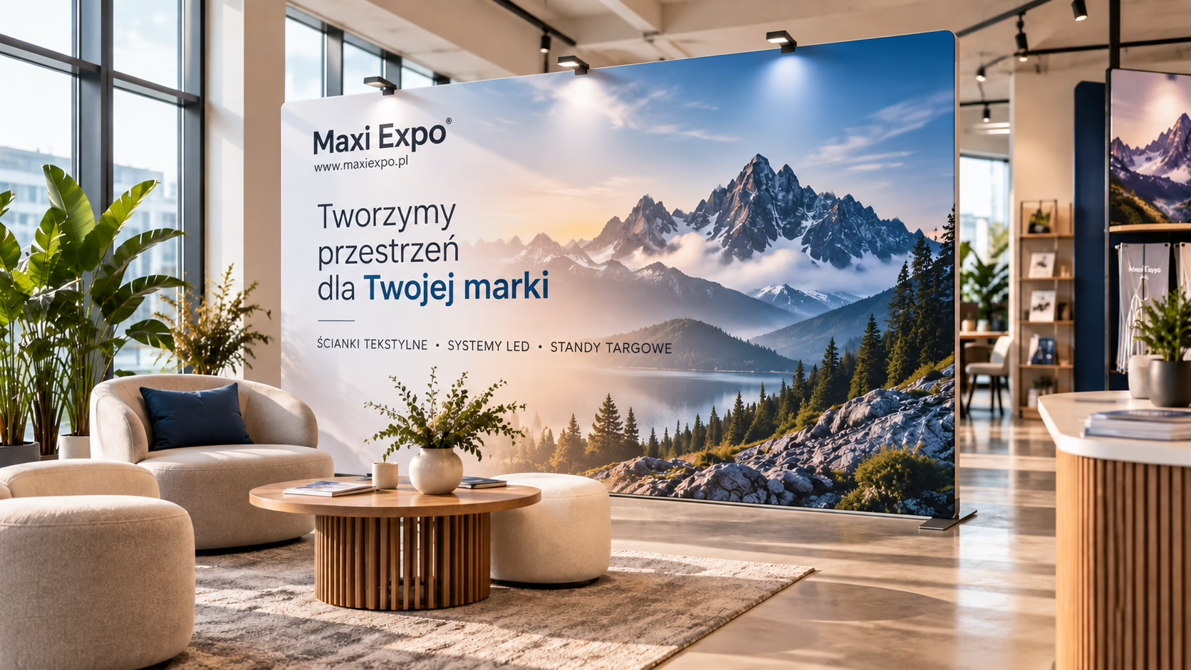
A fabric wall can be more than an advertising backdrop. Placed well, it organises the space, creates zones, shows off the brand and draws attention to key products or information. That's why it's useful not only at trade shows and conferences but also in showrooms, offices and points of sale.
Below you'll find layout ideas and tips on how to place the structure and prepare the graphic so the display is attractive, legible and suits the interior.
What role can a fabric wall play in an interior?
Before choosing the format and graphic, decide what the wall is for. It can be a permanent part of your visual identity or mobile equipment used during meetings, presentations and company events.
It is most often used as:
- a backdrop with a logo or brand slogan,
- an element dividing a larger room into zones,
- a setting for a product display,
- a backdrop for photos, recordings and online broadcasts,
- a display for information on the offer, promotions or new products,
- mobile decoration used at internal events.
A well-designed fabric wall for an office doesn't have to look like a typical trade show display. The graphic can reflect the interior design, the brand's architecture, the furniture colours or the way different zones are marked.
Comparison of uses in three types of space
| Space | Main role of the wall | Example graphic content | Key layout feature |
|---|---|---|---|
| Showroom | Creating a setting for the display | Image motif, collection, product in use | Consistency with the products on display |
| Office | Defining a zone or creating a prestigious backdrop | Logo, company values, a subtle graphic motif | Fit with the interior and everyday use |
| Point of sale | Attracting attention and conveying information | New product, product category, promotional message | Legibility from the right distance |
A fabric wall in a showroom: a backdrop that supports the product
In a showroom the product on display should come first. The wall gives it context, organises the display and enhances the atmosphere, but it shouldn't distract with too much content.
Launches and new arrivals zone
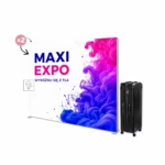
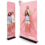
Behind a table, a plinth or a group of products you can place a simple wall with the collection motif. Large photos, sparing typography and one main message work well. An example of this solution is the Atlantis Straight – TUBE fabric wall, designed for presenting graphics on fabric.
If collections change seasonally, the structure can stay in place and the graphic can be replaced with each new campaign.
Soft space division
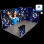
In a larger showroom a wall can separate the display from the customer meeting area, a presentation back room or a neighbouring product category. A curved form helps visually guide visitors and create a more intimate zone. This role can be played by the Atlantis Curved – TUBE fabric wall.
When dividing an interior, leave comfortable walkways and keep access to doors, equipment and circulation routes. The structure also shouldn't cover important signage.
A fabric wall for the office: practical ideas
In an office the system should suit how the room is used every day. A reception needs a different layout from a meeting room, and an open space used occasionally for company presentations needs a different one again.
A prestigious backdrop in reception
A wall placed behind reception can display the logo and the main visual identity motif. It's best to limit the number of messages. A website address, a long description of the offer and several slogans usually aren't needed where visitors only have to recognise the brand quickly.
Before placing the system, check the view from the entrance. The logo should also be visible when there is a counter, a monitor or a receptionist in front of the wall.
A backdrop for meetings, webinars and recordings
A mobile wall can replace a random background during online conferences, customer calls, recording expert content or management presentations. For this use, consider the camera frame. The key design elements mustn't be too low or right at the edges of the graphic.
A calm pattern with repeated but unobtrusive branding works well. Before recording, do a picture test to check logo legibility, colours and how the background relates to the speaker's silhouette.
An internal events zone
The same office fabric wall can be used during training, anniversaries, recruitment, open days and staff meetings. In that case, allow space for a counter, a screen, chairs or extra information materials. A modular layout makes it easier to adapt the arrangement to the nature of each event.
A fabric wall at a point of sale
In a shop, a service salon or a sales area, how quickly the message is taken in matters. Customers are surrounded by products, signs and information, so the graphic needs a clear hierarchy.
A backdrop for a chosen category
The wall can be placed behind a display of a specific product line. Instead of many photos, it's better to use one leading motif and a short category name. That way the structure works as a landmark and helps organise the customer's route.
Consultation or presentation zone
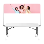
Where buying requires a conversation with a specialist, a wall can visually set apart the consultation area. Combine it with a counter or table in the same style. The graphic should build brand credibility without distracting the people talking.
Temporary display
A mobile system can be used to announce a launch, a seasonal campaign or an in-store event. Before setting it up, check that the wall won't block the view of the shop window, price signs and entrance, or disrupt the natural flow of customers.
How do you design an effective graphic?
The design should follow from where the wall stands and the distance it will be viewed from. A subtle reception backdrop is prepared differently from a message visible from the far end of a store.
- Set one main goal. It could be brand recognition, marking a zone or presenting a new collection.
- Build an information hierarchy. The logo, slogan and image shouldn't compete for attention.
- Allow for items standing in front. A counter, products and furniture can hide the lower part of the print.
- Keep safe margins. Important content shouldn't be placed at the edges or where it may fall on a bend in the shape.
- Check the design at interior scale. A graphic mock-up alone doesn't show how it will work with the lighting, furnishings and surroundings.
You or your designer prepare the graphic design, and Maxi Expo prints it in large format for the chosen system.
When should you consider LED backlighting?
Backlighting works where the display needs to be especially visible or the interior needs a striking visual focal point. That might be a showroom entrance, a promotional area in a store or a backdrop for a product presentation.
For such layouts you can use, among others, the LED BOX™ 2.0 with print or the modular LUNIX™ PRO – LED backlit exhibition system. A compact alternative for smaller displays is the LED BOX™ Compact with print.
Whether to use backlighting depends on the interior, power access, the planned placement and the nature of the graphic. An LED system can be the main element of the layout or complement a classic fabric wall.
Checklist before choosing a system
- Measure the available width and height of the space.
- Check the circulation routes and which way doors open.
- Decide whether the system will stay in one place or be moved.
- Plan what will be in front of the wall: products, a counter, a table or meeting participants.
- Check the view from the main entrance points and visitor routes.
- Decide whether the graphic should be brand, information or promotion focused.
- Decide whether the display will be single-sided or viewed from several sides.
- Allow for transport, storage and any assembly.
The most common layout mistakes
A common mistake is choosing a format without checking the actual interior. A wall that is too small can disappear in a large space, while one that is too big can obstruct movement and overwhelm the display.
Too much text, a logo hidden by furniture and colours that clash with the surroundings are also problems. At points of sale, also take care that the wall doesn't compete with information customers need to notice while shopping.
FAQ: fabric walls for offices and showrooms
Can a fabric wall be used permanently in an office?
Yes, it can serve as a permanent backdrop for a reception, meeting room or recording area. In that case, match the design to the interior and the company's visual identity, and avoid messages that will quickly date.
Where is the best place for a wall in a showroom?
Most often behind the main display, in the launch zone, at the entrance or as an element separating the presentation area from the meeting area. The location shouldn't restrict walkways or hide products.
Should you put a lot of information on the wall?
Usually not. It's best to choose one main message and complement it with the logo or a strong motif. Detailed information can be given in other materials or during a conversation.
Straight or curved wall: which should you choose?
A straight form works well as a classic backdrop placed against a wall. A curved one can help create a more intimate zone or guide visitors in a particular direction. The choice depends on the interior layout and the purpose of the display.
Can a fabric wall be combined with other systems?
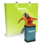
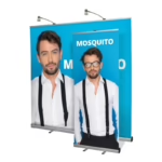
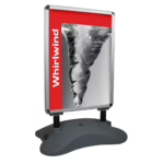
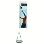
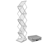
Yes. It can work with a counter, a roll-up, an information stand, a flag or an LED system, among others. All elements should form a consistent composition and have clearly defined roles.
Summary
A fabric wall can organise a showroom, create a professional backdrop in an office and highlight a specific zone at a point of sale. The result depends not only on the format and graphic but also on its placement relative to the entrance, products, furniture and walkways.
Contact Maxi Expo to choose a display system matched to your event, space and budget. The company offers sale and rental of display systems, large-format printing and transport.